Branding for Ben McQuhae & Co.
Ben McQuhae & Co is a hong kong based lawfirm that is specialized in businesses’ transition towards more sustainable practices. WE created an online identity to express this focus.
FLIP ME, I’M A BUSINESS CARD
Concept
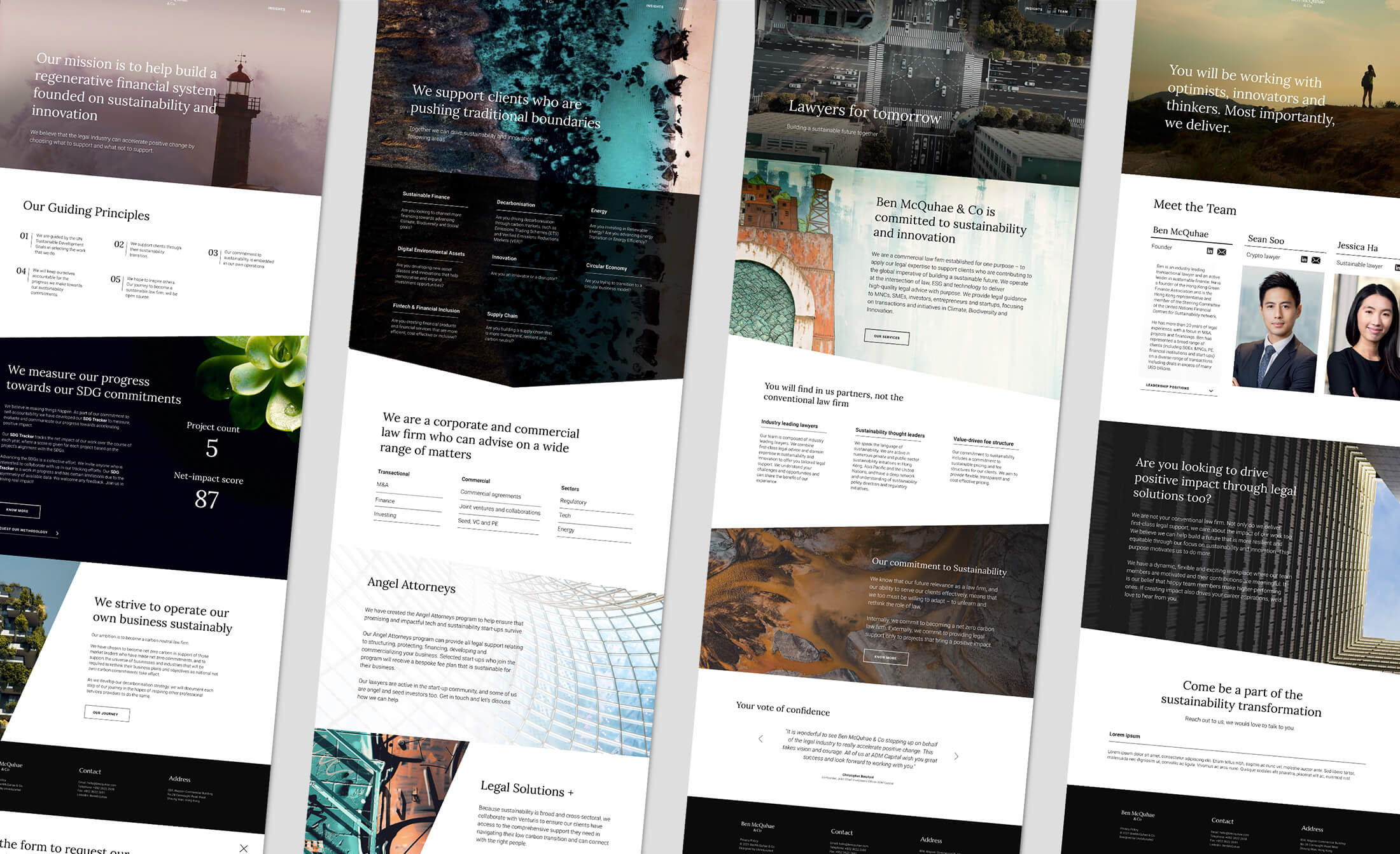
Ben McQuhae & Co is an early sustainability mover in the industry. Consequently, the goal was to make them stand as a fresh and new, but, at the same time, communicate the competency and year-long experience of the founders. Breaking conventionality without breaking style.
Visual Feel
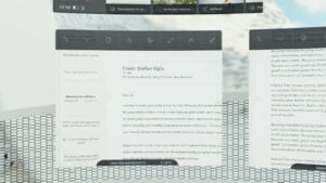
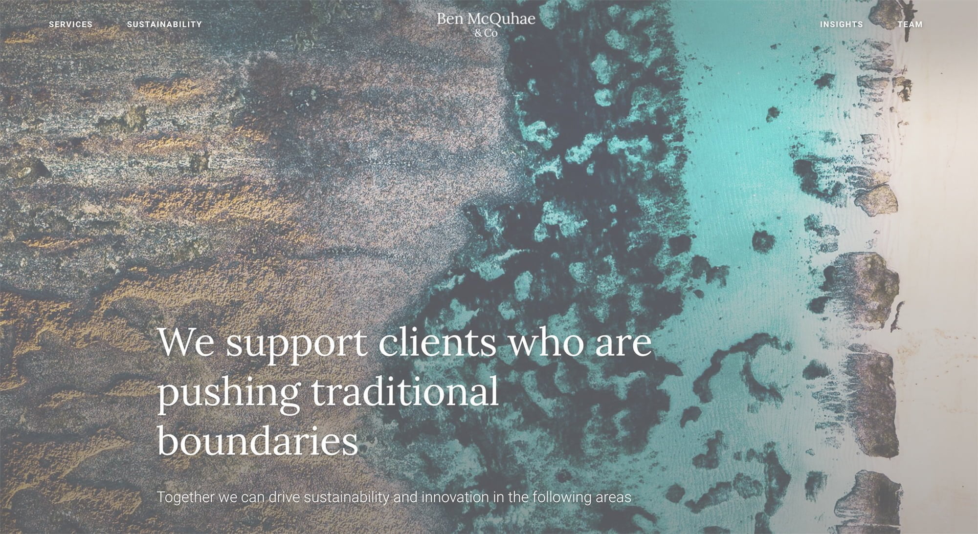
Efficiency and rigor are essential attributes expected from law firms. Hence we wanted to see these values reflected in the online communication. Animations are swift and simple to not distract from the written content. Large monochrome spaces separate subject areas for visual clarity. Abstract imagery enhances the message without diluting it.
Style
We balanced a unique logotype composed of highly organic shapes with clear, sober lines and contrast as well as elegant, restrained typefaces.
Headlines: Lora
ABCDEFGHIJKLMNOPQRSTUVWXYZabcdefghijklmnopqrstuvwxyz1234567890
Body: Roboto
ABCDEFGHIJKLMNOPQRSTUVWXYZabcdefghijklmnopqrstuvwxyz1234567890
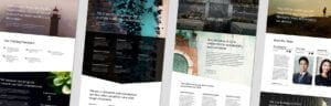
Responsive Visuals
Content is defined by abstract photography and art with architectural and natural motives. This duality signifies the company’s central mission: Helping business operate in a way that enables the coexistence of the human and natural realm. Full responsiveness across devices was ensured for all image material.